Friday, June 17, 2011

How the Casey Anthony Murder Case Became the Social-Media Trial of the Century

For my third critical media blog I chose the Time Magazine article titled How the Casey Anthony Murder Case Became the Social-Media Trial of the Century http://www.time.com/time/nation/article/0,8599,2077969,00.html#ixzz1PZl2sakF  

This article details the fascination the public and the press have with murder trials. This trial requires tickets for entry into the courtroom. Hundreds of people show up each day to watch the murder case unfold. But only those who arrive well before 8 a.m. and wait can get a pass allowing them into the top-floor courtroom where Anthony is trying to avoid the death penalty.

Anthony is accused of murdering her 2-year-old, Caylee, in 2008. In December of that year, investigators found parts of the girl's duct-taped corpse near Anthony's parents' home. The sheer horror at the act — and the idea that a mother committed it — catapulted the case from local live-at-5 sideshow to tabloid sensation to national preoccupation. The case is being followed by millions on live-stream video feeds and constant cable-news reports. In the past few days, the Washington Post and the Miami Herald have become the latest major outlets to begin offering live streams of the case. CNN and NBC air so much coverage of the trial that the networks each decided to erect a two-story, air-conditioned structure in a lot across from the courthouse.

The media mentioned above are relative latecomers to what is the first major murder trial of the social-media age. The first public mention of the case appeared on MySpace on July 3, 2008, when Cindy Anthony, Casey's mother, posted a distraught message saying her daughter had stolen "lots of money" and wasn't allowing her to see her granddaughter. Today, the latest and most reliable news of the trial comes from a Twitter account, NinthCircuitFL. That's the feed managed by the 9th Judicial Circuit Court, which has some 400 reporter-blogger followers. The various Facebook pages honoring Caylee have amassed tens of thousands of friends, and Twitter accounts like CaseyJunky and OSCaseyAnthony (managed by the Orlando Sentinel) are adding followers at a rate of hundreds per day.

Within the Casey Anthony article the author includes links to further his theory that this case is the social-media trail of the century. Links such as “Are Americans overly obsessed with the Casey Anthony trial?” are used to emphasize the author’s point of view. The author also includes links for reference TIME's photo-essay "Moms Who Kill.", the top 10 unsolved crimes, the top 10 crime stories of 2010, pictures of crime in Middle America, the top 10 crime duos,  why most child abuse goes unreported, and top 25 crimes of the century.

 These links are strategically placed within the article to direct the reader to more media content. Serafini (2011) notes, that meaning is derived from the position of images in the temporal sequence of written text. The meaning is derived from the spatial relations or grammar of visual images.

The magazine­­­­­ website solicits subscriptions and has a number of advertisements on every page just like every other online media of today. I found the website to be very user friendly and resourceful. The site contains links for the most popular searches, both most read and most        e-mailed. Viewers of the site can also see recommendations of their friends via Facebook social plugin. The Time Inc. site provides news from their partners (CNN, Huffington Post, AOL News, Rotten Tomatoes) as a one-stop visual shop for its readers. Seglem (2009) states, that the world is made up of visual symbols that require more complex thinking skills than traditional literacy requires. This one-stop shop strategy is also the focus of the Stay Connected with Time.com section at the bottom of the website page. This section offers RSS feeds, sign up for newsletters, Time widgets, Time mobile, Facebook fan, and Twitter updates.


References

Seglem, R. & Witte, S. (2009). You gotta see it to believe it: Teaching visual literacy in the English classroom. Journal of Adolescent & Adult Literacy, 53(3), 216-226. doi:10.1598/JAAL.53.3.3

Serafini, F. (2011). Expanding perspectives for comprehending visual images in multimodal texts. Journal of Adolescent & Adult Literacy, 54(5), 342-335. doi:10.1598/JAAL.54.5.4

Sunday, June 12, 2011

Basics of gravity and the law of universal gravitation- Khan Academy

For my second critical media blog I chose the YouTube video by Khan Academy titled Basics of gravity and the law of universal gravitation http://youtu.be/Xcel427Ezl0. According to the Khan Academy website (http://www.khanacademy.org/about) it is a free world-class education for anyone anywhere. “The Khan Academy is an organization on a mission. We're a not-for-profit with the goal of changing education for the better by providing a free world-class education to anyone anywhere. All of the site's resources are available to anyone. It doesn't matter if you are a student, teacher, home-schooler, principal, adult returning to the classroom after 20 years, or a friendly alien just trying to get a leg up in earthly biology. The Khan Academy's materials and resources are available to you completely free of charge.” Bill Gates of Microsoft is a supporter of the Khan Academy and includes information about the Academy in the Gates Notes http://www.youtube.com/watch?v=UuMTSU9DcqQ&feature=player_embedded

Each video is a digestible chunk, approximately 10 minutes long, and especially purposed for viewing on the computer. Drawings are made with SmoothDraw, which are recorded and produced using video capture from Camtasia Studio. Khan refused the format that would involve a person standing by a whiteboard, desiring instead to present the content in a way akin to sitting next to someone and working out a problem on a sheet of paper: "If you're watching a guy do a problem [while] thinking out loud, I think people find that more valuable and not as daunting. I teach the way that I wish I was taught. The lectures are coming from me, an actual human being who is fascinated by the world around him." Sal

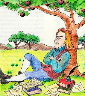
For this video on gravity the Khan Academy starts with a brief history of the pioneers in the field, Isaac Newton and Albert Einstein. Pictures are shown and Khan’s voice is heard discussing objects, such as an apple, falling from a tree. Khan notes that the pioneers thought outside the box and asked why did the apple fall from the tree?


Following the brief history Khan writes out and explains the universal law of gravity. Seglem (2009) states that the world is made up of visual symbols that require more complex thinking skills than traditional literacy requires. Khan’s use of video tutorials helps people with these more advanced or complex thinking skills. Serafini (2011) notes, that meaning is derived from the position of images in the temporal sequence of written text. The meaning is derived from the spatial relations or grammar of visual images. 


where:

  • F is the force between the masses,
  • G is the gravitational constant,
  • m1 is the first mass,
  • m2 is the second mass, and
  • r is the distance between the masses.

He explains how G is small and uses a calculator to show the calculation of his weight in Newtons. He then states that the force is equal between him and the earth at the calculated 686 Newtons because acceleration in the formula F= m x a (force= mass x acceleration) is super small.

 ­­­­­­­­­­­­­­­­­­­­­­­­

References

Seglem, R. & Witte, S. (2009). You gotta see it to believe it: Teaching visual literacy in the English classroom. Journal of Adolescent & Adult Literacy, 53(3), 216-226. doi:10.1598/JAAL.53.3.3

Serafini, F. (2011). Expanding perspectives for comprehending visual images in multimodal texts. Journal of Adolescent & Adult Literacy, 54(5), 342-335. doi:10.1598/JAAL.54.5.4

Thursday, June 2, 2011

A down town's big step up


In A down town's big step up


Chris Churchill business writer for the Times Union reviews the long

predicted rebirth of downtown Troy.


The recent announcement of a $31.5 million plan to grace Monument Square with two new buildings that

would include 106 apartments and ground-level retail space is noted. This redevelopment is touted

as transformational for downtown Troy.

In addition to the Monument Square renovations, two new restaurants-- Bootleggers on Broadway

and Broadway Brew Pub and Grill—are preparing to open on a stretch of street struggling since 2009.

Down on the waterfront, the much-anticipated Dinosaur Bar-B-Que is open and thriving. The city is also

set to begin a $1.8 million redevelopment of Riverfront Park.

At the Congress-Ferry street corridor workers are building the first phase of the $160 million

CityStation development, which will target the city’s student population.

Downtown still has its share of problems: vacant storefronts, stores close too early,

problematic landlords, and the struggle to keep middle-class homeowners.


The project itself also faces hurdles: an ever-cantankerous Troy City Council

must agree to sell the city-owned land to developers and the project lacks funding.

The city’s coordinator of economic development, Vic Christopher, is however positive.

He comments that the massive building that is CityStation is transforming its corner of Troy. And to Christopher, the rising building is symbolic of a rising downtown.

The author of this article states his opinion of the city of Troy and the content of his article in his subject line “A down town’s big step up”. This deliberant use of phrasing indicates that the author agrees that Troy is headed in the right direction. He is, however, cautious and plays the devil’s advocate noting the problems and hurdles the city faces. Finally, at the end of the article the author details out the three significant proposals for the city of Troy. This extensive detail gives great information to the newspaper’s readers. 

­­­­­­­­­­­­­­­­­­­­­­­­­­­

The Times Union­­­­­ website solicits independent contractors to deliver the

 newspapers at the top of the page in addition to quick links for subscriptions, customer care, advertisement placement, and the weekly TV magazine. Seglem (2009) states, that the world is made up of visual symbols that require more complex thinking skills than traditional literacy requires. I found the website to be rather cluttered and

non-user friendly. Advertisements are predominant and are a constant distraction on every

page. Their size, color, special effects, and of course, the content varies.

The index, or table of contents, is listed at the bottom of the page instead of the top or the right

of the page. The intent here is to ensure viewers look at the entire page when browsing. The meaning of the page to viewers is therefore dictated by the content at the top of the page, mainly advertisements.

Serafini (2011) notes, that meaning is derived from the position of images in the temporal sequence of written text. The meaning is derived from the spatial relations or grammar of visual images.  The danger in this design is that the content, the words, are not being read but instead the images are conveying all of the message.


References

Seglem, R. & Witte, S. (2009). You gotta see it to believe it: Teaching visual literacy in the English classroom. Journal of Adolescent & Adult Literacy, 53(3), 216-226. doi:10.1598/JAAL.53.3.3

Serafini, F. (2011). Expanding perspectives for comprehending visual images in multimodal texts. Journal of Adolescent & Adult Literacy, 54(5), 342-335. doi:10.1598/JAAL.54.5.4